
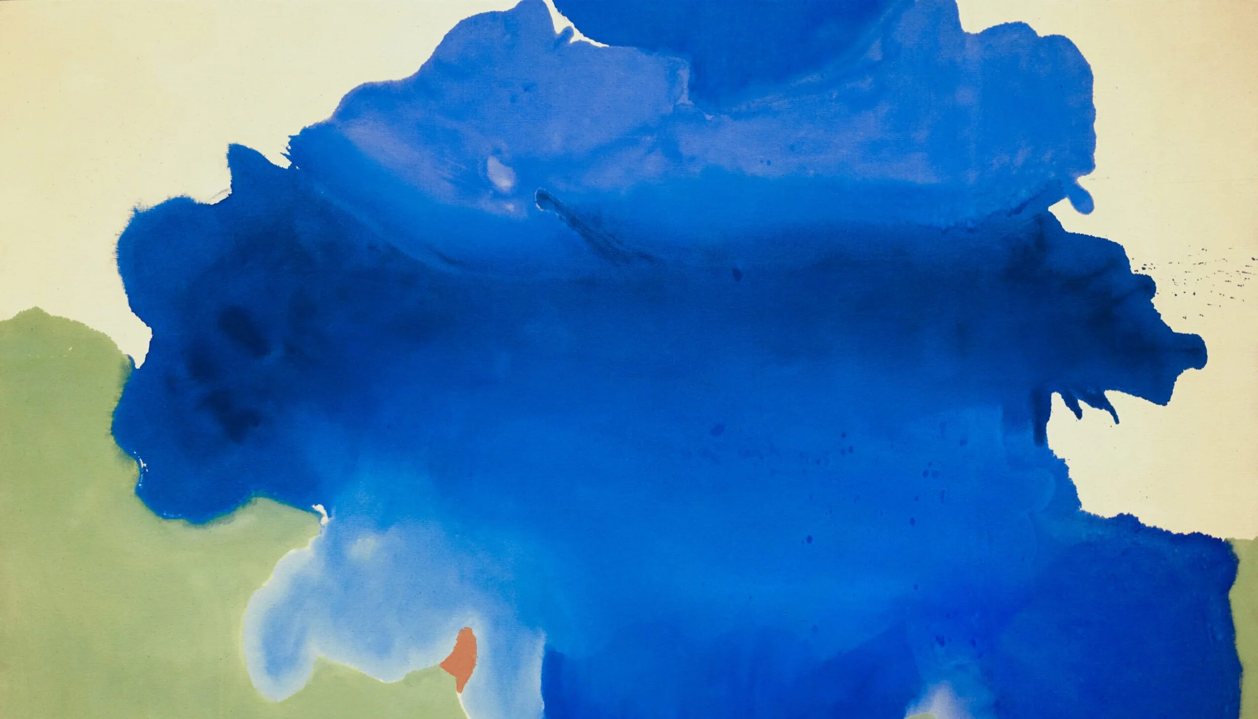

Blue
“Have nothing in your house or on your boat that you do not know to be useful or believe to be beautiful.”
Wm. Morris, as adapted. To which I’d add: there is no need for decoration; decoration is not design. This is often misunderstood in the English culture (culture being the learned behaviour that encodes an intergenerational process, AKA humanity’s persistence).
My boat, shown here, follows this dictum and is unusual in that the majority of modern narrowboats are painted to ape a long-gone era when canals had a working life; boats had stripes, decorations and other designs to signify ownership and operation. The two blues I have chosen are by Designers Guild; SAINTE CHAPELLE NO. 54 and PRUSSIAN BLUE NO. 52.
Blue is clearly an important and beautiful colour. It is the colour of a jacket I own and is offset by the vibrant orange hat, in this picture from the bathroom. A limited edition work: Blue 3, Orange 1, Green 1.
Sky
As an aside… why is the sky blue? The sky appears blue to the human eye because short-wavelength blue light is scattered more than the other colours in the spectrum, making it more visible. I have used the common shorthand here, ‘wave’. Though of course, light is light and manifests as both a particle and a wave.
When the Sun's light reaches the Earth's atmosphere, it is scattered, or deflected, by atmospheric gases, mostly nitrogen and oxygen. Because these molecules are much smaller than the wavelength of visible light, the amount of scattering depends on the wavelength. This effect is called Rayleigh scattering, named after Lord Rayleigh, who first discovered it.
Shorter wavelengths (violet and blue) are scattered the most strongly, so more of the blue light is scattered towards our eyes than the other colours. You might wonder why the sky doesn't actually look purple since the violet light is scattered even more strongly than blue. This is because there isn't as much violet in sunlight to start with, and our eyes are much more sensitive to blue.
You might also notice that the sky tends to be most vibrant overhead and fades to pale as it reaches the horizon. This is because the light from the horizon has had further to travel through the air, and so has been scattered and rescattered. The Earth's surface also plays a role in scattering and reflecting this light. As a result of this increased amount of scattering, the dominance of blue light is decreased, and so we see an increased amount of white light.
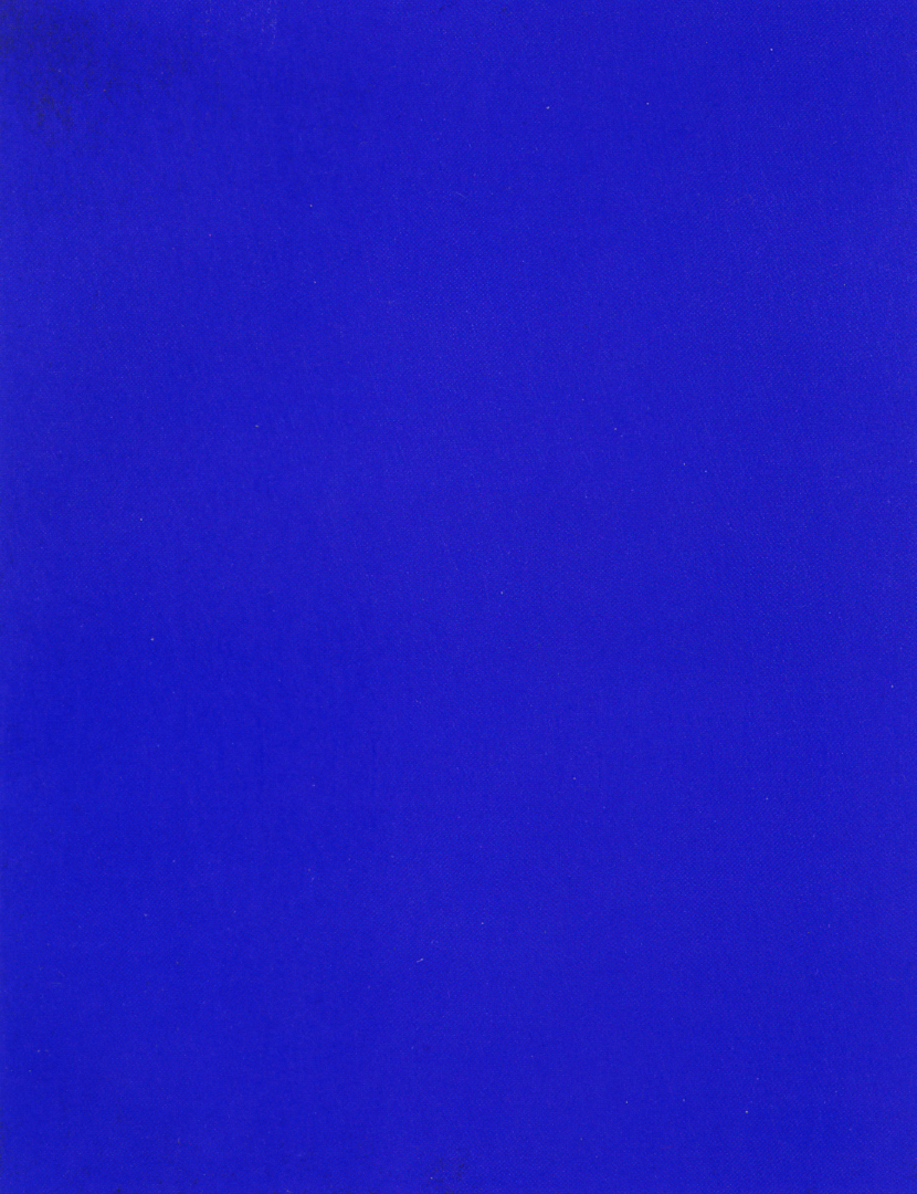
IKB (International Klein Blue)
An outstanding blue. No account of the colour could, or should, ignore IKB. “At his (Yves Klein 1928–1962) 1957 exhibition in Milan, he displayed a series of eleven ostensibly identical blue monochromes, each with a different price, which he claimed reflected its unique spirit. As he explained: 'Each blue world of each painting, although the same blue and treated in the same way, presented a completely different essence and atmosphere”
YInMn ( A new blue)
The crudities of the technology here fail us. Missing the intensity of colour and the difference between IKB and YInMn. Shown here as slightly less refulgent than IKB, but this isn’t the case ‘in reality’. YInMn Blue (/jɪnmɪn/; for the chemical symbols Y for yttrium, In for indium, and Mn for manganese), also known as Oregon Blue or Mas Blue, is an inorganic blue pigment that was discovered by Mas Subramanian and his (then) graduate student, Andrew Smith, at Oregon State University in 2009. The YInMn Blue story may be found here.
Ultramarine
Before Klein, there was ultramarinus — "beyond the sea." The pigment came from a single mountain range in Badakhshan, in what is now north-eastern Afghanistan, where the Sar-i Sang mines have yielded lapis lazuli for some nine thousand years. Venetian traders carried the stone across central Asia and through the Levant; by the time it reached a painter's studio in Florence or Delft, the raw material had crossed a continent. Making the pigment was the second difficulty. The stone had to be ground, worked into a paste of wax, resin, and oil, then kneaded repeatedly in dilute lye; only the finest blue particles — the lazurite — separated into the solution. The first wash gave the truest colour. Yield was two or three per cent. Through the fifteenth, sixteenth, and seventeenth centuries, ultramarine was, by weight, more costly than gold.
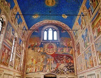
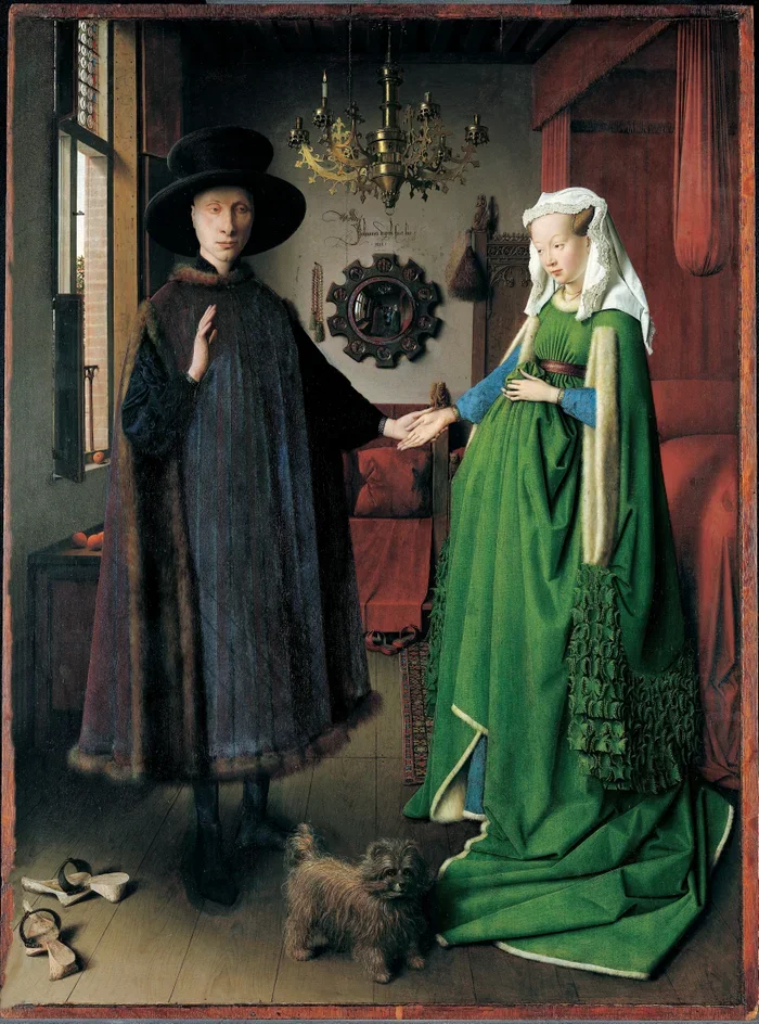
Its price determined its use. Patrons bought it by the ounce and named it specifically in commission contracts — most often for the robe of the Virgin, where the cost of the material and the theology of the subject reinforced each other. Giotto painted the Scrovegni Chapel at Padua between 1304 and 1306, the vault a deep ultramarine field of stars and the Lamentation set against a sky of the same pigment; he worked al secco, onto dry plaster, because the blue could not be risked in the chemistry of wet lime. A century later, in the Netherlands, Jan van Eyck was refining the medium itself — not inventing oil painting, as the old story has it, but bringing it to a finish that tempera could not reach. Oil allowed slow, translucent layering; pigments could be suspended in glazes and built over weeks. The Ghent Altarpiece (1432) and the Arnolfini Portrait (1434) belong to this new technical order, and ultramarine in oil became luminous in a way it had never been in egg tempera. Titian's Bacchus and Ariadne (1520–23, National Gallery) sets a vast ultramarine sky against the near-white of Ariadne's robe — a bravura piece of expenditure. Raphael, working at the same moment, laid azurite — a cheaper copper carbonate that tends with time to green — beneath and reserved ultramarine for the final coat. Vermeer returned to it obsessively: the turban of the Girl with a Pearl Earring (c.1665), the jacket in Woman Holding a Balance, the shadowed walls of The Milkmaid. He used it in underpainting, where it would never be seen, and died leaving his widow in debt. Michelangelo, the traditional account runs, could not afford it: his Entombment in the National Gallery has an unfinished figure at the lower right where the Virgin was to have been, her absent mantle the usual explanation.
The end of natural ultramarine's monopoly came in 1826. The Société d'Encouragement pour l'Industrie Nationale had offered a prize of six thousand francs, two years earlier, for anyone who could synthesise the pigment at under three hundred francs a kilogram; a kilogram of the natural material was then running to ten thousand. Jean-Baptiste Guimet produced a chemically identical blue by heating kaolin, soda, sulphur, and charcoal, and kept the method to himself. Christian Gmelin at Tübingen found a similar route within two years and published it. French Ultramarine, as the synthetic was called, reached painters through a newer trade — the artists' colourman — which had expanded across London and Paris during the later eighteenth century. Reeves (founded 1766), Rowney (1783), Winsor & Newton (1832) and their Parisian counterparts industrialised what had been a workshop craft: they bought pigments in bulk, ground and bound them, and sold ready-made paints to the studio. In 1841, the American portrait painter John Goffe Rand patented a collapsible tin tube for oil paint, replacing the pig's bladders and glass syringes of the previous two centuries. The tube made the palette portable; without it, as is often said, there would have been no Impressionism. Turner, already restless with the old limits, was the first significant painter to take up the synthetic ultramarine, in 1834.
The twentieth century added a new binder. Acrylic resins came out of German chemical research before the First World War; Leonard Bocour and Sam Golden in New York produced the first artists' acrylic, Magna, in 1947, a solvent-based paint taken up by Pollock and Rothko. Water-based acrylic emulsion followed in the mid-1950s under the Liquitex name. Acrylic dried in minutes, held its colour on unprimed canvas, and behaved equally well in thin stain or thick impasto — the medium on which Frankenthaler, Louis, and Noland built the soak-stain work of the 1950s and '60s, and on which Hockney painted A Bigger Splash (1967). The blue that Yves Klein bound with a synthetic resin to produce IKB in 1960 is the same ultramarine compound Guimet had worked out in his kiln — now inexhaustibly available. Helen Frankenthaler using blue.
The Complicated History of Blue
Blue enters English from Old French bleu, from Frankish blao, from Proto-Germanic blēwaz, from Proto-Indo-European bhel-: "to shine, to flash, to burn." The same root yields blaze, blank, bleach, and — across a strange semantic crossing — black. Ancient blue-words slide easily between blue, grey, dark, and bright; the colour we now call blue was, for the speakers of those older languages, not a stable category at all. The Old English word was blǣwen; it was displaced by the Norman bleu after 1066 and never recovered. Of course, there was much that never recovered :-)
Greek
Homer never names the sea blue. He calls it oînops — "wine-dark," wine-faced — and the sky bronze or iron, and oxen wine-coloured, and honey green. In 1858, William Gladstone, then briefly out of office and at work on Homer, devoted a chapter of his Studies on Homer and the Homeric Age to the strangeness of the colour vocabulary; black and white dominated, red and yellow appeared occasionally, blue was absent. The German philologist Lazarus Geiger took up the puzzle a decade later and ran it across Hebrew scripture, the Vedic hymns, Old Chinese, and the Icelandic sagas. The pattern held. Every culture names black and white first, then red, then yellow and green, and only last — sometimes thousands of years after the others — does it name blue. Hebrew has no general blue-word in the Old Testament. The Rigveda has nothing for blue across more than a thousand hymns. Japanese ao still floats today between blue and green. I’m following Guy Deutscher's Through the Language Glass (2010), here.
Why so late? One reason is that blue is rare among the natural pigments. There are no widely available blue plants, blue earths, blue stones — except for one, in one mountain range. To make blue, on any meaningful scale, you have to manufacture it.
Egyptian
The Egyptians were the first. Egyptian Blue — calcium copper silicate — was synthesised by around 3250 BCE, and appears stably from the Fourth Dynasty onwards, by the time of the Pyramid of Khufu. It was made by heating silica sand, copper, calcium, and an alkali flux to 850–950°C, a temperature that required deliberate furnace control. The pigment is genuinely blue, deeply stable, and luminescent in the near-infrared — a property only rediscovered in the late twentieth century and now used by conservators to detect traces where the colour has otherwise faded from the surface. It travelled the Mediterranean for three and a half thousand years; it appears on Etruscan tomb paintings, on the Parthenon frieze, on Roman wall plaster at Pompeii. The recipe was lost in late antiquity and was not recovered until 1814, when Humphry Davy, working on samples from the Baths of Titus in Rome, identified its composition.
In the centuries in between, painters made do. Azurite, a basic copper carbonate mined in Hungary, Saxony, and Spain, gave a serviceable blue but tended over time to green or black as it reacted with the binding medium. Indigo, from Indigofera tinctoria and from European woad before it, was largely a textile dye but found use as a watercolour wash and a glaze. Smalt — powdered cobalt-blue glass — appeared in the sixteenth century and was used heavily in the Netherlands; Vermeer and Rembrandt both used it, though it fades. None of these matched ultramarine for intensity, and ultramarine, as the previous section sets out, was for centuries the most expensive substance on the painter's bench.
Prussian
The eighteenth century brought a rupture. In 1704 or 1706 — the date is disputed — a Berlin colour-maker named Diesbach, working on a batch of red lake, contaminated his potash with iron and produced, by accident, the first modern synthetic pigment: Prussian Blue. It was deep, lightfast, cheap, and within twenty years it had reached the studios of every European capital. Hokusai's Great Wave off Kanagawa (c.1831) is Prussian Blue. Picasso's Blue Period (1901–1904) leans heavily on Prussian Blue. Cobalt blue followed in 1802, when Louis-Jacques Thénard worked out a process for fixing cobalt oxide on alumina; Monet's blues are largely cobalt and synthetic ultramarine. Cerulean, named from the Latin caerulum (sky), was developed by Andreas Höpfner in 1805 and refined for artists' use by George Rowney's company in 1860. By the end of the nineteenth century, the painter had perhaps a dozen blues to choose from, all of them affordable. The one chromatic colour that for nine thousand years had to be wrestled out of the ground or imported across continents had become a tube on a shelf.
Sea
The sea is blue for two reasons that have nothing to do with each other. The first is the same reason the sky is blue: the surface reflects the sky. The second is intrinsic to the water itself. Pure water absorbs red and infrared wavelengths far more strongly than blue — not by scattering but by direct absorption into vibrational modes of the O–H bond. A long enough column of water, with no sky to reflect, is still blue: this is what divers see at depth, and what makes deep glacier crevasses blue. The deeper the column, the more red has been stripped out, and the bluer the residue. The two effects compound at the surface. The Mediterranean, on a clear day with a low sun, can take on the saturation of a pigment.
Feeling
Then the feeling. Blue in the sense of melancholy is attested in English from the late fourteenth century, originally in the literal sense of leaden or livid — the colour of a bruise, of cold flesh, of a corpse — and shifted to the figurative by the 1500s. Blue devils appear in the early seventeenth century to mean the apparitions seen by the depressed or the delirious; Robert Burton uses the phrase in The Anatomy of Melancholy (1621). By the early nineteenth century, in American usage, the blues had contracted out of blue devils to mean low spirits in general; Washington Irving uses it in 1807. By the end of the century, in the African-American South, the word had been carried into music — into the twelve-bar form, the flattened third and seventh, the call-and-response between voice and instrument that came out of the work song, the field holler, and the spiritual. W.C. Handy's "Memphis Blues" (1912) is the first published blues composition; the form is older than the publication by at least a generation. Bessie Smith recorded "Down Hearted Blues" in 1923 and sold three-quarters of a million copies in six months. By the time Robert Johnson recorded in San Antonio in 1936 and Dallas in 1937, the form had become the structural ancestor of almost every popular musical genre that followed it: rhythm and blues, rock and roll, soul, country, hip-hop. The word blue in English, by then, carried four overlapping meanings — a colour, a feeling, a music, and the music's parent feeling — and was used freely in any of them without explanation.
Blood and Collars
A few smaller currents. Blue blood is from Spanish sangre azul, sixteenth-century, describing the visible veins of pale-skinned Castilian aristocrats who claimed not to have intermarried with the Moors. True blue is older, fifteenth-century, from the dyer's trade: a fast blue that did not run was true, and the word migrated to mean loyal. The Scottish Covenanters wore blue against the royalist red in the seventeenth century; the colour transferred, by the strange logic of party history, to the English Tories, who carry it still. The blue uniform of the police is a Peelite invention of 1829, chosen specifically not to be the red of the army. Blue-collar, as a class marker, is American and twentieth-century, by analogy with white-collar, first attested in 1924.
Risqué
Blue in the sense of indecent — a blue joke, blue language, working blue — has a contested origin. The OED's earliest citation is from 1818, in John Mitford's Adventures of Johnny Newcome in the Navy, where the colour is the blue of burning brimstone. The OED is uncertain whether this quotation is continuous with the later, settled sense. That settled sense surfaces in Mactaggart's Scottish Gallovidian Encyclopedia of 1824 — "Thread o' Blue" for "any little smutty touch in song-singing, chatting, or piece of writing" — and Carlyle is using blueness in the figurative sense by 1840. The most-cited etymology, John Camden Hotten's in his Dictionary of Modern Slang (1859), traces the usage to the French bibliothèque bleue, the cheap blue-papered chapbooks hawked through France from the seventeenth century to the nineteenth; the OED disputes this on the grounds that the bibliothèque bleue was, in the main, devout in content. Other proposals: the blue gown worn by convicted prostitutes in houses of correction; the blue spotlight filter switched on for the rougher passages of a burlesque act; the blue envelopes used by the Keith-Albee management to instruct vaudevillians which lines to cut, recalled by Sophie Tucker in Some of These Days (1945). The trade carried the term forward — blue material, blue book, working blue — and into broadcasting, where it named everything the code would not pass.
Risqué is the loanword counterpart. The French verb risquer — from Old Italian risco, ultimately from Latin resecare, to cut off — is attested in French from 1578. The past participle, used adjectivally to mean "verging on the indecent, hazardously suggestive," enters English in 1867, in the work of Ouida (Marie Louise de la Ramée).
Pencil
The two-coloured editor's pencil — blue at one end, red at the other — became standard equipment for the working editor in the later nineteenth century; Faber was offering them by 1873, and blue pencil was being used as a synonym for "edit" or "censor" by 1888. The blue end was Prussian Blue. In Britain, the Lord Chamberlain's blue pencil licensed every play submitted for the public stage under the Licensing Act of 1737 and the Theatres Act of 1843, and continued to do so until the Theatres Act of 1968 abolished the office's authority. Shaw's Mrs Warren's Profession waited nearly thirty years for a licence; Beckett's Endgame was held up over a single line, and was passed only when bastard was substituted with swine. The doctrine survives in common-law contract as the blue pencil rule, by which a court strikes out an unenforceable clause and lets the remainder of the agreement stand.
Blue on Blue
The military usage is post-war. Blue, on the NATO map, denoted the friendly force; red, or in some exercises orange, denoted the Warsaw Pact. The convention settled in the early 1950s with the standardisation of NATO tactical symbology, and from the map it carried onto the radio: blue on blue became the term of art for friendly fire — for an allied unit firing on its own. The Americans had friendly fire, the kind of euphemism Orwell named in Politics and the English Language; the British and most of NATO used blue on blue, colder and more clinical. The older soldier's word — fratricide — is at least honest about what has happened.